CYCLING UK Project type: FULL SERVICE INTERIOR DESIGN. COLLABORATION.
The charity Cycling UK asked for my help in updating their Guildford offices.
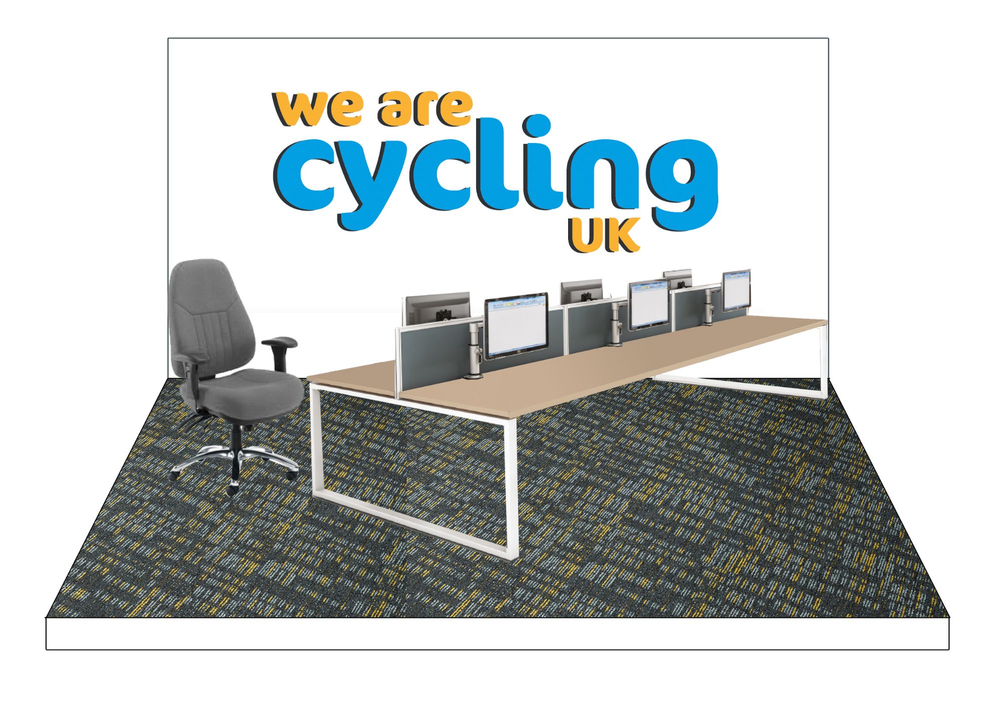
The entrance/reception area was a dumping ground for deliveries. The lunch area was a windowless room which was inefficently laid out. The office space was congested and unwelcoming. They needed more WCs and more shower & changing facilities for staff cycling to work (located right by the wondowless kitchen area).
The space was not particularly stimulating for the people working there and didn't reflect the rich history of the charity which originated as the Cyclist's Touring Club in 1878. The whole flow of the space needed rethinking. to improve the experience for staff and visitors.
BREAK AREA
Applying my WELL and FITWEL healthy building learnings - I know it’s important to get this area of a building right. We want to encourage people to take breaks away from their desks and eat healthily.
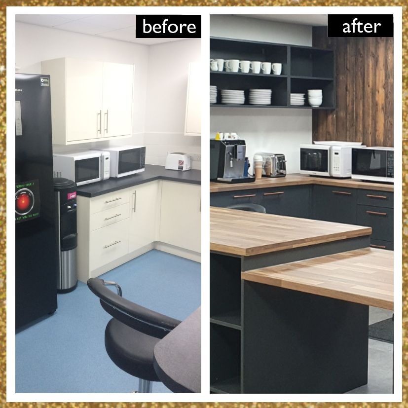
The congested kitchen was in a brightly lit, windowless, airless space that was a thoroughfare and was also a post area. It looked unloved and that gives the wrong message to the people working there. It needed a window. There was no point ignoring it. I convinced the client ....and then Garrick Architects got permission for the window. I so would have loved it to have been a door to an outside sitting area - even a veggie patch. The client resisted and so it was a window.
But what a difference an openable window has made to the space!
🌿 Improved air quality
🌿 View through to a garden space - and there are huge health and wellbeing benefits of that! The project isn’t finished yet. When it is I’ll get professional photos on here.... and get more plants in that kitchen.
🌿 Biophilic wellbeing benefits from the use of timber and natural materials
Quote from WELL Building Standard... “Exposure to views and images of nature can help to speed up healing and recovery time, boost positive feelings and reduce negative ones. Interior environments that are cold, sterile and devoid of life, on the other hand, can diminish our experience, mood and happiness.”
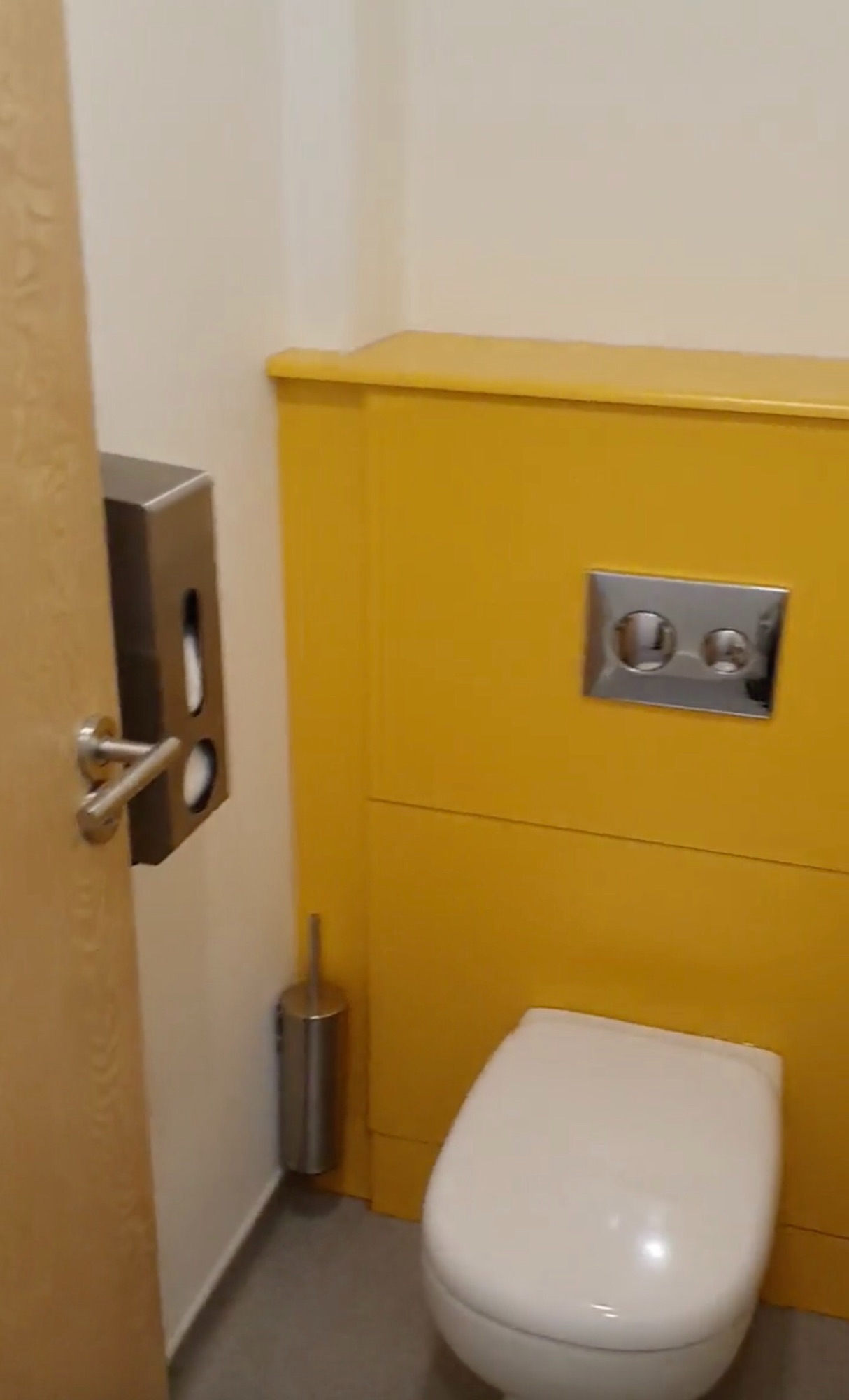
I relocated that drying room too. Now they have a proper changing area with a shower - that is separate from the visitors area and plenty big enough for the growing team. By rejigging the spaces we now have a better flow for all those using and visiting the building.

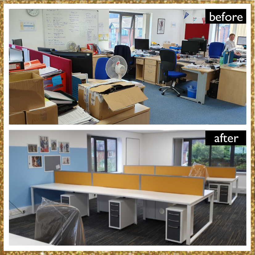
The work was phased to keep core staff working during the updates. Then work slowed right down when the pandemic hit us, The project is not yet fully completed.
Professional photos will follow...
Project steps: ALL:
- Briefing and site visit
- Interior design concept
- Design development and sourcing
- Detail drawings and specification
- Trade liaison
- Purchasing
- Designer on site
- Client binder
- Branding advice and implementation

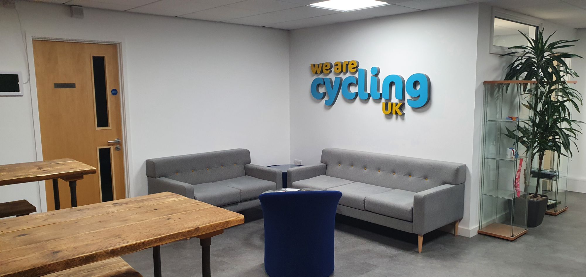


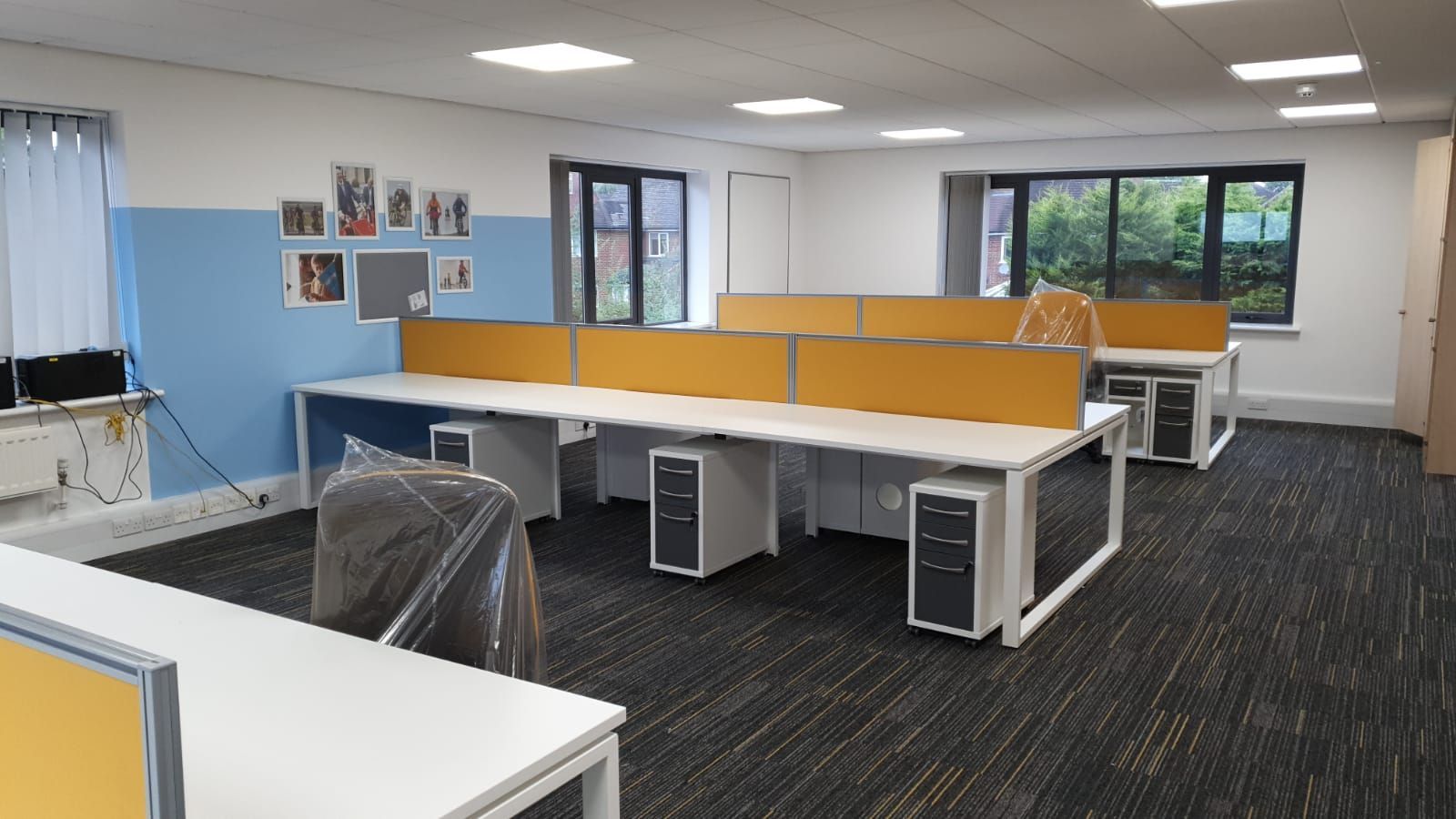
The following elements were incorporated into the design:
-
Task chair and desk divider upholstery: 100% recycled polyester, Oeko-Tex certified for safe use of chemicals
-
LED lighting
-
Old furniture taken by company who will resell
-
Old carpet tiles were recycled and reused
-
Carpet tiles: Total Recycled Content: 43.1%
-
Recyclable and 10% recycled content new safety flooring
-
Recycled and recyclable new carpet tile flooring: 100% recycled fishing nets (econyl) with mostly recycled PET bottle backing
-
Non animal-tested paint
-
Recyclable aluminium signage
-
Building contractor recycles building waste
-
Entrance matting made from recycled airplane tyres
-
FSC certified (100%) kitchen unit doors. From supplier who recycles or refuses 97% of their manufacturing waste. 12k tonnes sawdust used to power 2 sites. Pallets are repaired. Carbon reduced fleet transport.
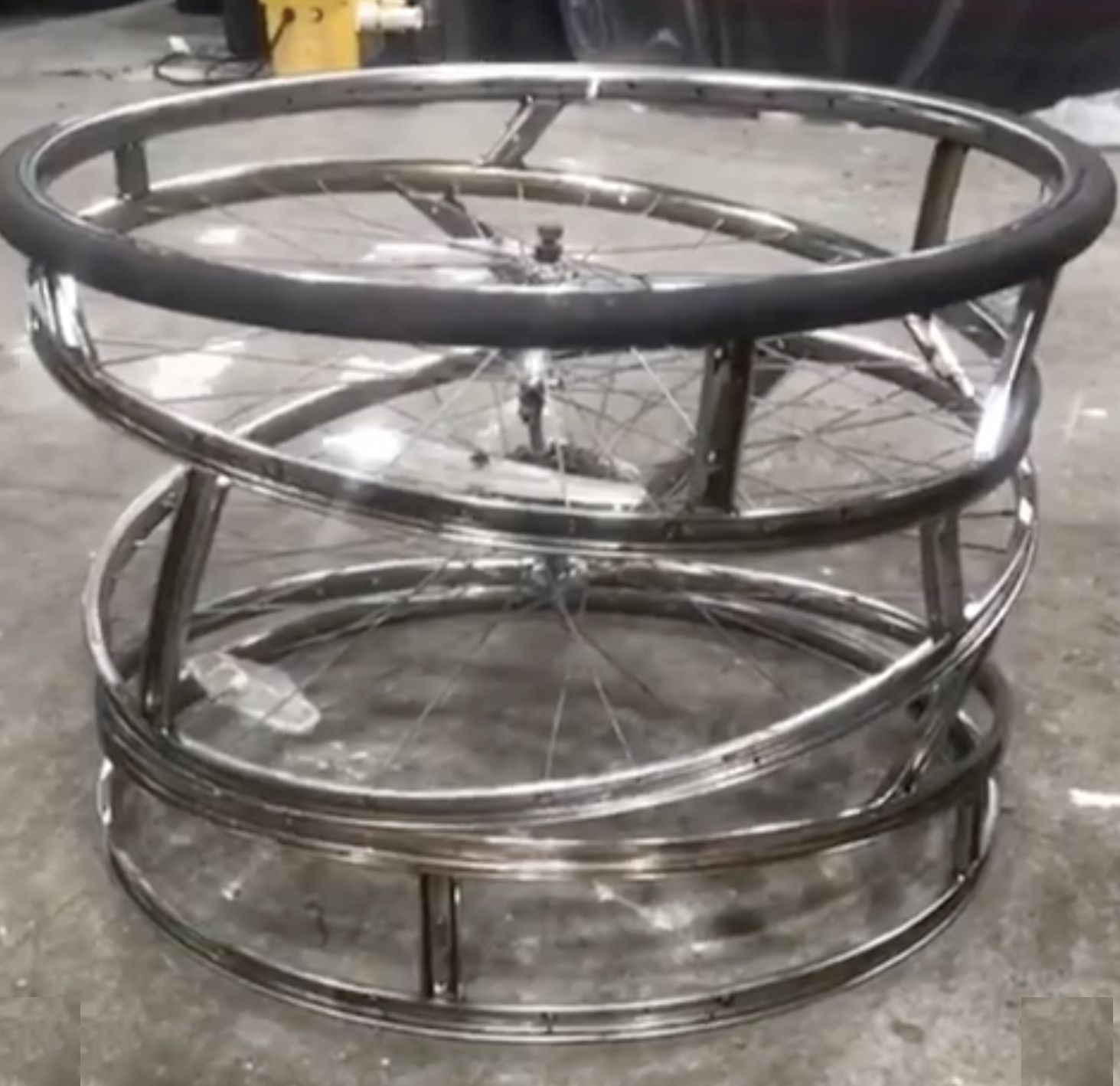
- Upcycled elements - use of reclaimed timber
